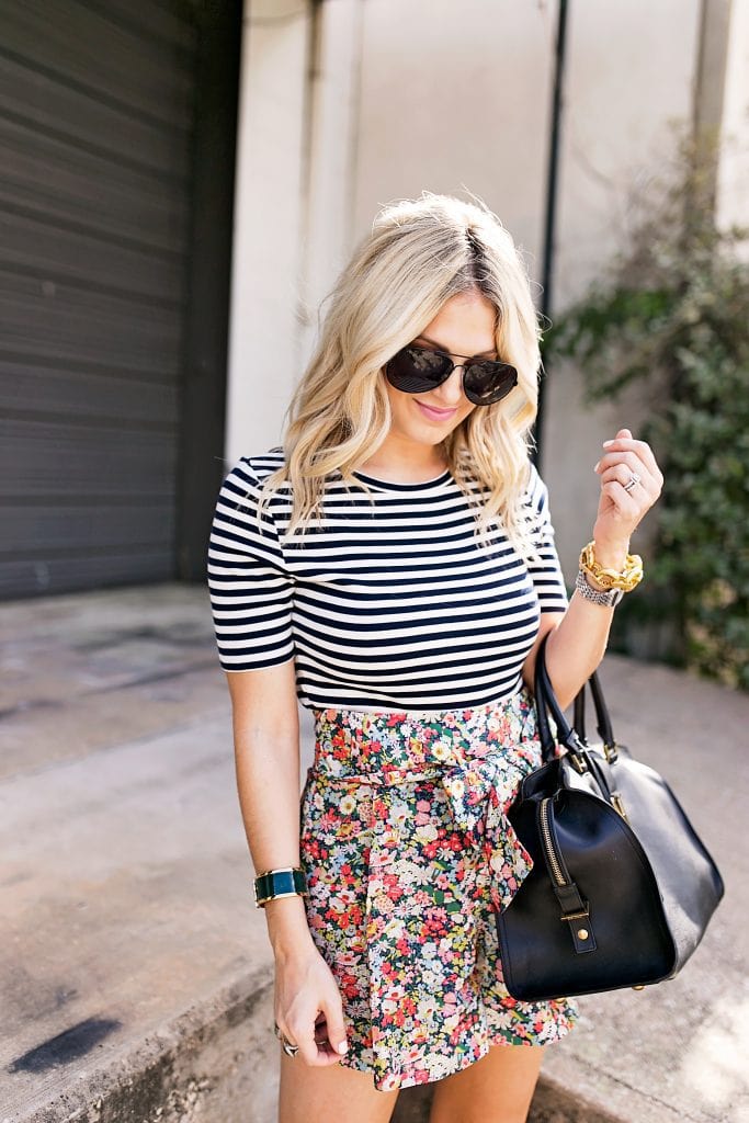
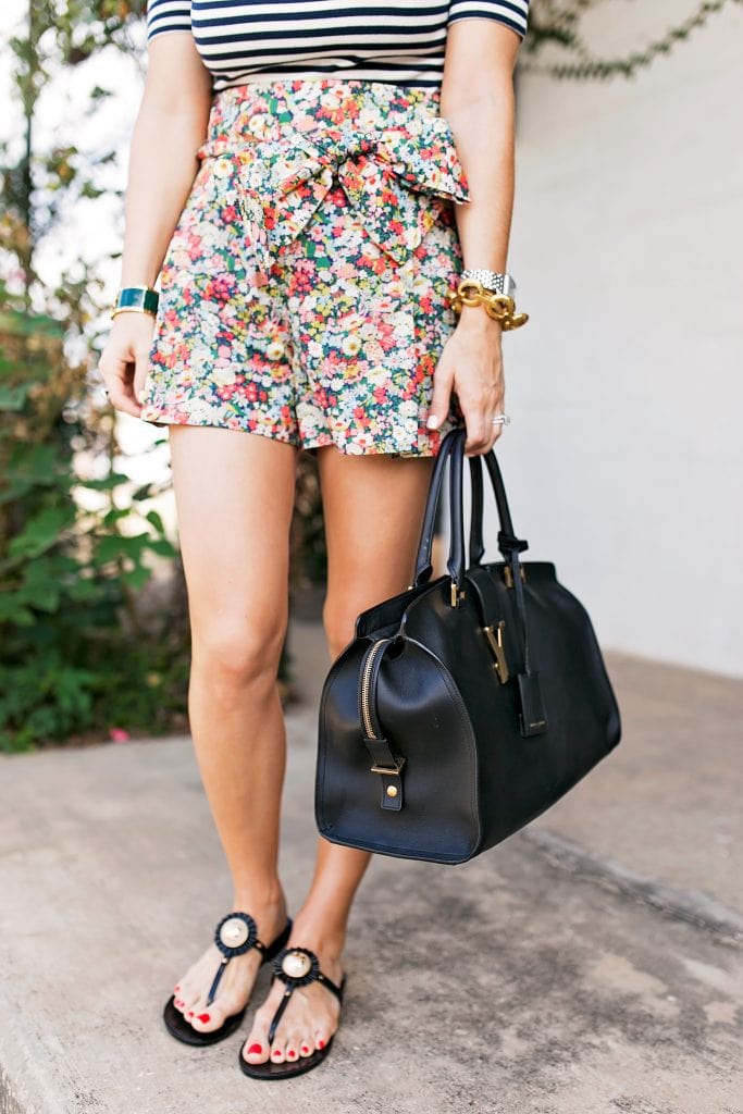
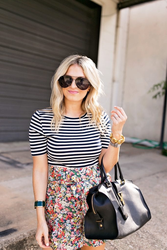
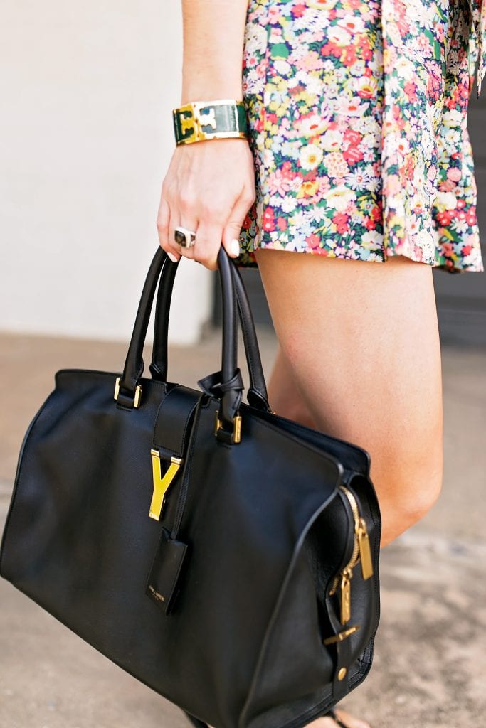


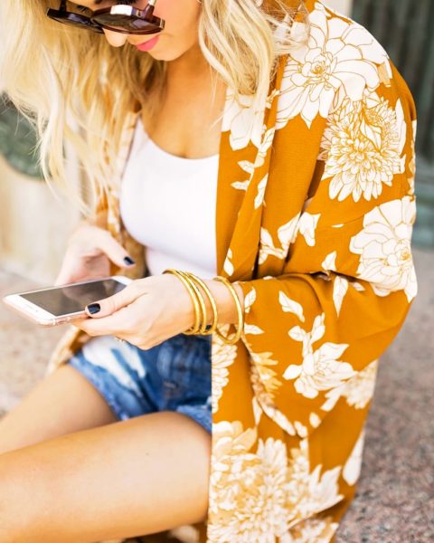
Top: J.Crew, Similar | Shorts: J. Crew , Love These! | Sandals: Tory Burch | Bag: YSL, Similar | Sunglasses: Nordstrom | Bracelet: Julie Vos [c/o], Tory Burch
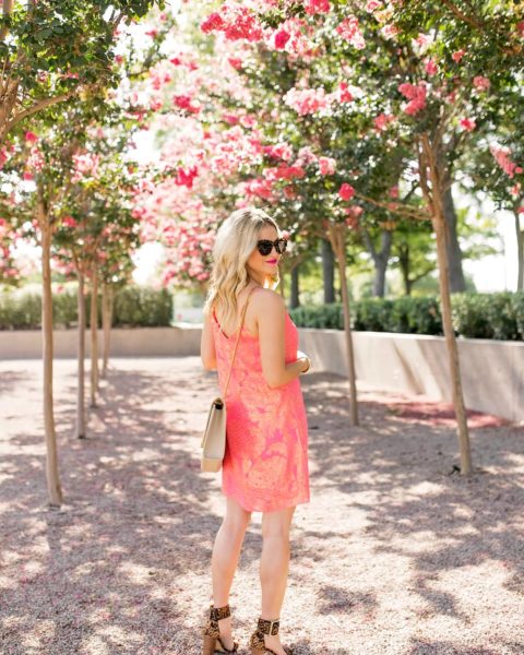
Photography by: Angie Garcia
It’s almost July and I’m excited and just as equally nervous. I’ll have some exciting news and projects to share very soon, but we head to Colorado this weekend and once we get back we are going 200 MPH. I have some of the biggest work projects [of my career thus far] + Paul’s birthday + really crazy life updates all in the week that we get back. It’s one of those things where I’m like, “Do I just try to not think about it during vacation so I don’t freak out or do I just laugh because we are so busy?!” On the bright side, it is all GOOD news and I don’t require much sleep! Can’t wait to fill you all in!
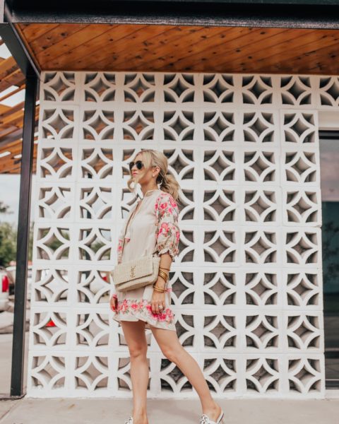
In other news, let’s talk ways to dress up this summer. It’s HOT and HUMID and Maxi has started to want all my jewelry. The other day if I took this Julie Vos bracelet [pictured] away from her she started crying. I kept thinking, “And so her stealing my items begins!” haha! All of that to say, I’ve been relying on print mixing to make my look fun as opposed to wearing layers or 6 stacked bracelets.
Print mixing is one of my favorite ways to sass up a look, but it’s a lot like a spray tan. When done well, it is amazing. One wrong shade and it all goes downhill! It’s nice to do this time of year because I don’t add layers to my look to add in new elements or textures, but I can easily add in a print with my top or shorts. Here’s a few tricks to making this an easy outfit option:
Tricks to Print Mixing
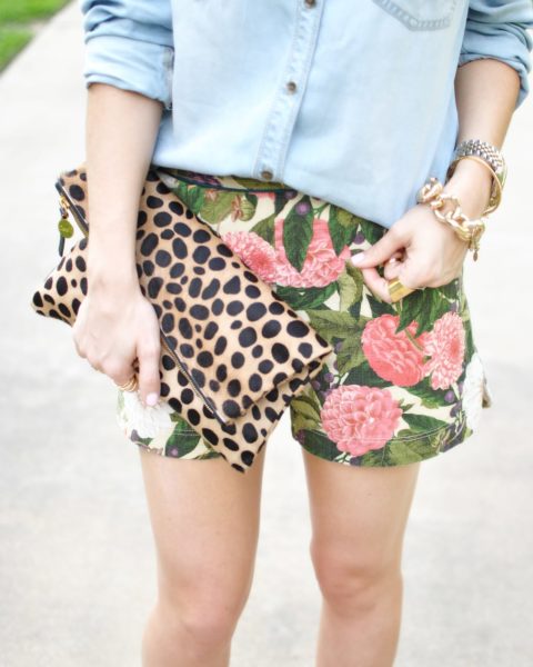
1. Keep One Print Simple
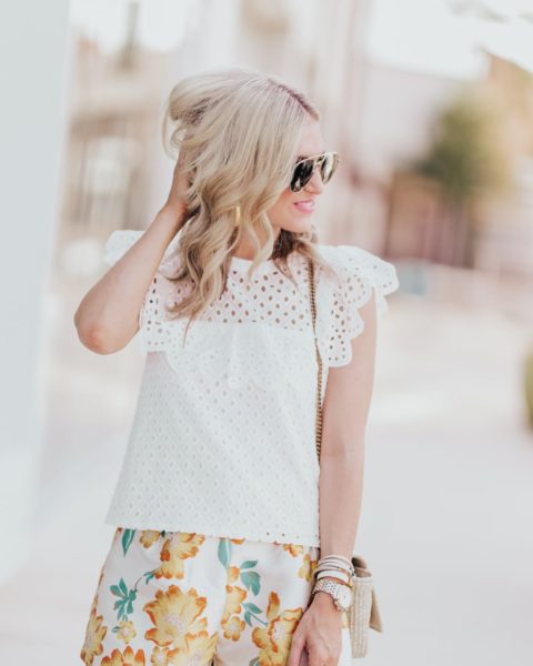
One trick with print mixing is to make sure one of your prints only has two shades and generally keep them neutral. My top has black and white stripes which easily blends with this floral print. White or black can be spotted in most other prints allowing it to flow seamlessly.
2. Floral, Striped or polka dots
If you aren’t one to add in ikat or leopard spots, stick with the three basic prints. These are the vanilla ice creams of the world in terms of prints…the go with just about everything! Make one of your prints floral, striped or polka dotted. These timeless prints aren’t *as* loud and can be pulled off whether you’re a classic girl or love to try trends.
3. Match One Color
Lastly, make sure there is one consistent color in both prints. For this look, you can spot a touch of black in both prints. Eyes are automatically drawn to consistent colors and tones, so when you try on your prints you won’t feel like, “Wow! This is ummm…a bit much.”
I keep the rest of my look pretty simple with natural lipstick, summer sandals and a coordinating bag. Do you have any rules you follow when print mixing?!


I hardly ever match prints together, but these are great tips! Might try them next time I attempt this!
Charmaine Ng | Architecture & Lifestyle Blog
http://charmainenyw.com
Gorgeous! You can’t beat a good stripe but I’m super impressed with how well it marries with a cute floral!!
Gemma
http://www.fadedwindmills.com
I have never mixed prints-mostly because I don’t own a lot of prints and also because I feel I’m not the type to pull it off. I do love your tips though and your outfit looks great and pulled together! My eyes definitely get drawn in to the black like you said!
I have both of these pieces in my closet, but never would have thought to put them together. LOVE this look!!
I love this look, and LOVE these tips!